Experimental Cocoalicious Tag Browser
by Jonathan Deutsch
This has been mentioned before and presented at TagCamp, but I thought I’d finally make an actual post about it.
A while ago, I was using Buzz’s Cocoalicious, and realized that as my list of tags grew, the tag browser became less useful; the alphabetically sorted list didn’t scale.

the original Cocoalicious tag browser
The problem is there are too many tags in the list and most tags have only one post associated with them (the long tail), making it difficult to find a tag which will result in a useful set of posts. Additionally, making a multiple selection to find intersections usually resulted in empty sets, since I didn’t have a good sense of which intersections would work. Since Cocoalicious is open source, I decided I’d try to make a better tag browsing interface.
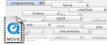
The main goal was scalability, but it took several iterations (and In-N-Out burgers with Buzz) before that was fully realized. Here’s what the final version looks like:

click for a larger view
The new tag browser uses a button grid, similar to GarageBand’s loop interface. Tags are sorted by their post count, thus more relevant tags are always found at the top, keeping scrolling to a minimum. When a button is highlighted, all related posts are displayed in the table below, and at the same time tags in the tag browser which do not intersect the selection fade away while related tags bubble up to the top. Beyond being a slick effect, the animation gives a nice visual cue as to where the next location of the buttons are and helps identify relationships between tags.
This interface scales quite nicely; each click cuts down the tag list significantly, and the bubbled-up tags are physically close and always related, so searching and scrolling is rarely required. It also works well for exploring the “long tail,” since the previously insignificant tags eventually come to the top. Dare I say, using it is a lot of fun! Here’s a video of it in action:
click to download the 3.7 MB quicktime video
A few less noticed features are that tag browser has full keyboard navigation and type-ahead, and the button grid can be sorted alphabetically. The animation effect itself is fast and can run well even on my 800 Mhz iBook.
Overall, I’d say my new tag browser is a vast improvement, and should make it into a Cocoalicious build in the near future.
UPDATE: Buzz talks more about some of the design issues.
holy crap. That’s cool.
oooh shiny
Wow, that’s very cool. I’m part of a team working on a new open source e-mail client called Kiwi. Would it be possible to use your implementation in our client because we will be supporting tags? You can find out more about the e-mail client at http://www.theronge.com
Quite impressive. This is the sort of approach that is going to make tags managable. One question: Would it be better to make all selected tags sort ahead of unselected tags? That would guarantee that all selected tags (at least the first 41) were visible.
Wow, nice job. Definitely better than the existing system. And you should really let Matt use this for Kiwi.
Very nice use of animation and a generally well thought-out visualisation.
Have you thought about implementing option-clicking a tab to show all items that don’t contain that tag (ala iPhoto)? Probably not all that useful.
Also, why, when you reach a set of possible tags where each tag has a count of only 1, are they placed before your selected tags when the default behaviour seems to be to place the tags after?
I like this. It’s a very smart way of handling the complexity of tags.
The only thing that I would suggest that would be an improvement is that it *not* filter on every tag selected.
For example, let’s say I am a cocoa developer and I have been tagging a lot of cocoa sites with ‘cocoa objective-c programming apple’, I also do some database programming and so I have some sites with the tags ‘database sql programming’. Then along comes Core Data and I want to start bookmarking some Core Data pages. I need to be able to tag with ‘cocoa objective-c programming apple database sql’. But the problem is is that after I click on cocoa and objective-c I don’t have database and sql as choices to click on. (Unless I am missing something…?)
I would rather instead that every click reorder based on likelyhood and all the unlikely things be unfilter, but left at the bottom.
What do you think?
Matt – Cocoalicious has a BSD-style license, so once I’ve integrated it into that, you can take the source and use it however you’d like! There however are still a few issues to work out, and it isn’t up to sync with the latest version of Cocoalicious at this point, so I’ve got some work to do before then.
Stephen – I originally had it so the selected tags showed up first, but in fixing another bug, I thought I’d try the grouping completely alphabetically. I agree all selected tags should come first.
Andy – That is a really interesting idea!
Lee – If you have tagged your Core Data pages with all tags, then database and sql will show up, and clicking on those will show only the Core Data pages (since those are the only ones that intersect cocoa, objective-c, database, and sql). It may be interesting to show related, yet non intersecting keywords (since they share a relationship through the programming tag), but I think that is outside the scope of this interface.
[…] [self setNeedsDisplay: YES]; – Experimental Cocoalicious Tag Browser (thanks Buzz) […]
Andy C wrote about negating tags and then commented, “Probably not all that useful.”
I must disagree. Adding a way to negate tags is another important element in managing large numbers of items and tags.
While one of the great advantages of tagging is that items can carry multiple tags, in modeling the world, there are sets of tags that are mutually exclusive over all items. For example, we might divide the world into X, Y, and Z (e.g., animal, vegetable, and mineral). If we create tags “X,” “Y,” and “Z,” then any item that does not carry one of these tags is incorrectly tagged. The ability to negate tags makes it relatively easy to hunt for this serious type of tagging error. Ultimately, improving the tagging of items will improve the utility of tagging. At least, that’s what I think. 🙂
very good idea. i found cocoalicious useful for the exact same reason u stated, i will have a look at future builds to test your interface, thanks a lot.
–jens h.
Hey, you’ve got a nicely implemented solution there! At first blush it looks to take up a bit of room, but does pack powerful functionality in there, with perhaps some room for growth…
I wouldn’t be too worried about initial resistance, so long as the animation isn’t too bad on ‘real world’ hardware, the utility of the interface should win over… you’d hope anyway! : )
The video helped a lot, but I do have a couple of questions/comments:
I know you’ve followed the GarageBand precedent, but perhaps ‘Reset’ could be ‘Show All (Tags?)’, and be highlighted as the default selection when no other tag is selected, to articulate that all tags, and therefore all links, are shown until a specific tag is selected?
Is there any means of showing the tags that are applied to a given article via this tag grid element (i.e. basically a reverse filter)? Like the Address Book, you could option-click an article to highlight the associated tags (via a colour highlight), or more emphatically an option-click on an article could filter the tag grid to that article’s tag set, and consequently filter the article list to other matching articles.
Since we don’t have a working example yet, are there some features that stand to be lost in this element?
Have we lost the ability to drag one or more articles to a tag (i.e. dropping the articles ‘into’ the tag, as a container) to apply that tag to those articles? It seems like that could still be supported by dragging a tag from the tag grid, onto a single article, and perhaps multiple selected articles (if not too awkward)?
This change to the tag browser seems to bring with it a fairly fundamental change; the browsing pane is nowhere to be seen in these mockups, so what will the article selection/activation behaviour be?
Will the page load in place of the article list? If so you’ve added branching to the navigation. Or are links intended to be off-loaded to the default browser?
Finally, have you considered how to handle Bundles? Cocoalicious doesn’t support Bundles, of course, so that’s excusable, but I just wonder if they’ve been considered in the scope of this design?
Without going into it too much, Bundles could be shown above the tag grid as another level of filtering (too much vertical space), or as collapsable groups in the tag grid (a la iPhoto Film Rolls) which would allow collapsing the tags to their parent Bundles, as a more course filter criterion.
Perhaps more efficiently Bundles could be shown as an optional parent selector sidebar to the left of the tag grid, that could be shown to view by Bundles, or hidden to revert to your original mockup.
As a vertical scrolling list, the Bundle list could operate like a ‘standard’ Sidebar; clicking on a Bundle would filter the tag grid to just the relevant tags, and perhaps support Cmd-clicking to select multiple Bundles.
Alternatively, of course if the desire were to emphasise the fact that multiple Bundles could be selected, the list could be a vertical stack of your tag grid elements, to make clearer that several could be selected.
OK, that’s way too much now! : )
cheers
Wow! That was a long post marc! To try to respond:
Actually, performance was one of my goals. Even with a very large tag set, it runs very smoothly on my 800 Mhz iBook.
That makes sense.
In theory, this makes sense and could be quite powerful, but I’m also it afraid it may be confusing. A complete reverse filter would show all posts that are identically tagged, which will most often be none, but could be some. Highlighting sounds like a great way around this (and letting the user choose what they want), but then the interface is being cluttered with lots of different colors, and many tags will be “lost” since they will need to be scrolled to. What’s great about this interface is how little scrolling you have to do.
Actually, the tags are completely draggable, but I’ve commented out the code since there’s no targets yet. I’ve seen the kind of tagging-by-dragging in some Microsoft Vista demos, and I think it is pretty awkward though. Buzz and my idea was to be able to create smart folders by dragging tags to a source list.
The browser pane is still there, just not being shown. It works just as it always did, albeit prefers a screen in portrait mode now :-).
I have made my best effort not to consider bundles. Tags are meant to be a flat space, afterall! :-). I’ll think about your ideas for a bit. I think the best thing might to have bundles be like a side-filter.
Thanks for the feedback!
[…] If you have the same problem as me, that Cocoalicious wont sync with your del.icio.us account, I have a small hint for you. You just have to change the url for the api in the preferences panel. The correct url is https://api.del.icio.us/v1/. That helps for me . Hint: Have a look at the experimental cocoalicious tag browser. […]
[…] http://www.tumultco.com/blog/?p=43 […]
[…] Personally, I’m pretty thrilled with the application as it is, and have only one feature request: please, please, PLEASE drop the brushed metal interface. Or at least offer us an option to toggle back and forth. I’d love to see a fresh new UI like that used by Mail.app or NetNewsWire, with the tags in a pane on the left and your bookmarks listed on the right, and a divider (like the one used now) to open, close, or resize the built-in browser. Combine that with a new, modern unified toolbar (not Mail.app’s lozenges, please!) and perhaps incorporate some of the tag UIs that have been proposed (like this one), and you’ve got yourself one killer del.icio.us client. […]
So…this is dead?
Too bad.
Not dead at all! It was just never integrated with Cocoalicious.